How complex games teach, part 1: Distance triggers
Article complexity: simple ▰▱▱
This article is part of Primed, a series on how games teach, explained from a technical perspective. Written with professional game developers in mind, this series covers problems that I keep running into when I do consulting for game studios.
The goal is to equip you and your team with the right vocabulary to discuss solutions, and to focus your attention on the trade-offs that you will have to make.
- 🐌🐌🐌 This page might take a while to load, as it contains a bunch of uncompressed videos (I'll fix this when I find the time)
- This page is optimized for PC. You can view it on mobile, but the interactive section won't work (sorry)
- My career so far has leaned more towards PC/Console projects, and towards non-linear/sandbox gameplay. This shapes my perspective on how games are made.
The basics
At some point, you will want to show something to the player, to teach them something. So you make up rules for when a UI element should appear on screen. Distance triggers are among the most common ways of achieving that. I've ran into them on every project I worked on, especially for player-onboarding work. Here's an example, with the game on the left side, and what I think is happening on the right side:
(if you've worked on this game and know better, please let me know and I'll edit this article accordingly.)
Player perspective
Dev perspective
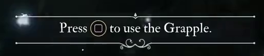
You're probably familiar with these: a game shows something when the player goes too far ("leaving the combat area!"), or when the player gets close to something ("you've reached your destination"). Simple stuff, right?
Game dev is hell
WRONG. Nothing is easy in game development.
Let's use a very well-made Kingdom Come: Deliverance II (KCD2) tutorial to make my point.
This section takes 5-10mins to read and interact with. By the end, you'll get a sharper sense of how player-onboarding rules that feel simple at first (if player close then show this) can spiral into systems that suck to design AND to maintain. Watch the video below:
Player perspective
Dev perspective
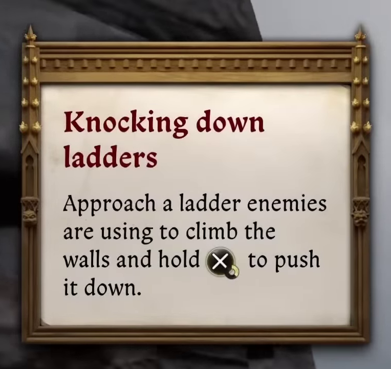
Do you understand what's going on? In the top-left corner of the screen, why did the message about ladders appear when it did? Can you explain why the message appeared 8 seconds after the player reached the ladder?
The KCD2 tutorial looks similar to the Expedition 33 one, but it's actually different in two ways.
Same trigger, different results
I'll explain the 8-seconds difference soon, but before we need to mention the overall design philosophy: KCD2 is an open-world, and its UI needs to somehow work without knowing 1) when the player will do things and 2) which other game systems are also currently active. To illustrate, compare our first player against 3 other youtubers playing through the same moment:
@MKIceAndFire (our reference)
@GameClips4K60
@Dilfenshmirtz
@Shirrako
| Message triggered at | Player reacts at | |
|---|---|---|
| @MKIceAndFire | 0:16 | 0:18 |
| @GameClips4K60 | 0:37 | 0:50 |
| @Dilfenshmirtz | 0:21 | 1:23 |
| @Shirrako | N/A | N/A |
The game shows the message early for two players, and later for GameClips4K60 (Shirrako never gets anything, probably because of a third system that triggers the cutscene if the game concludes that the player is struggling). Adding to the complexity: it's not only about when the game shows something. The time it takes for the player to react to the message is also matters.
Watch-out: variance
In complex games, even simple and deterministuc rules (like a distance trigger) can lead to each player getting a slightly different experience. Unlike their more linear counterparts, complex games get better when the UI team split their time 50/50: half of your time on designs for the ideal situation (the tutorial appears at the perfect time), and half on supporting the less-than-ideal outcomes.
I observed hundreds of players back when I was a user researcher. This gave me a useful perspective, I was among the first to see how outcome variance would mess with our plans. Here are some solutions/compromises that dev teams came up with:
Some solutions
- Bounds and failsafes: instead of writing rules like "the message should appear after 10 seconds", designers include both a floor and a celing value: "We show this as soon as the player gets in range. We also show this if it's been 4 minutes and the player has yet to get in range".
- Diversify: instead of using distance triggers for everything, devs use a mix of different trigger conditions (timers, failure, periods of inactivity, return moments, etc.). I'll cover these in my upcoming articles.
- Notification queues: see below
Our game will be annoying, or confusing
What caused the 8-seconds delay in our KCD2 example? It's a notification queue. I could explain with words and images, but over the years I've noticed that game devs prefer manipulating something while they learn, so I made a playable testbed instead. Try to understand by moving the character towards the following items: the ladder, the barrel and the crane. (I've moved us to a third-person perspective, as it makes it easier to gauge distances):
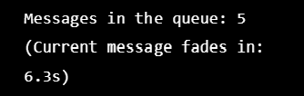
When we give players freedom, we also give them the freedom to trigger more notifications than the game can gracefully show. The testbed shows a simple scenario, but your game might need you to solve problems like
"what if the player picks up three items, levels up, and receives a multiplayer invite at the same time?"
I'll describe some solutions below, but since you cannot control when players do something, you have a higher-level choice to make. Where do you want your game to land on the following spectrum?
Less confusing) (Less clutter,
More confusing)
In the testbed above, I configured the notification queue towards the nagging end of the spectrum: Messages stay on screen for 7 seconds, and every message is shown. The flipside is that some messages get "stale", shown with such a delay that they can feel meaningless. Now try the testbed below, I dialed the queue towards the other end of the spectrum:
Here the notification queue tries to get rid of messages faster, at the cost of legibility (more messages = shorter display duration for each).
Watch-out: notification queues
Complex games often end up with a notification queue. When you design yours, you'll need to find a compromise between two conflicting desires: Keeping the screen clean and clutter-free, and making sure that players have the information that they need. Have a chat with your team about where you all think the game should be on the nagging-to-confusing spectrum.
Some solutions
- Merge: When appropriate, merge multiple messages into one (+3 items instead of three separate item pick-up messages)
- Priority: rank your messages from most-to-least important, then merge, rate-limit or suppress anything that competes with an important message.
- Make messages findable again: It's a lot of work, but allowing players to open a log of previously displayed messages can really help. Star Wars Jedi: Survivor does this realy well. I also like GTA Online's implementation of this, but I'm biased on this one.
Conclusion
So what does this testbed and those videos teach us? two things:
- You cannot know with 100% accuracy when your distance triggers will fire. You can guess, but you cannot be certain - even in very controlled spaces like these castle battlements. How players move and look, and other game systems (like notification queues, or NPC behaviour) will create variance: each player getting a slightly different experience. I bet that this is the #1 reason why some games ship with those tutorials that block all player movement until a specific button is pressed - the devs want control, precision
- But you can mitigate problems by adding failsafes, and by taking a clear stance on the nagging-to-confusing spectrum.
- I lied at the top of the page when I set this article's complexity to "simple". Even simple-looking systems invite a ton of nuanced trade-offs.
A note for the veterans devs who read this
I picked these concepts because they belong to a class of problems that are effectively INVISIBLE. You can document every state of a UI element and never realize that there's a problem. It's less about layouts, and more about continuity from frame to frame.
Worse yet, our work documents often make us forget about these issues. Just like our players can get tunnel vision and become blind to parts of the screen, our repeated use of apps like Figma and Photoshop (plus the design reviews that happen around them) focuses our attention towards the static - frames and screenshots. They can make us blind to how systems interact at runtime.
Watch-out: invisible design choices
Industry veterans understand this stuff instinctively, but our juniors probably won't notice the invisible on their own. It's our job to find ways to make them think through these problems. I prefer in- or out-of-engine prototyping for that, but I've seen talented people make it work with lo-fi videos, paper prototypes and even Lego blocks.
Next steps
I will start working on the next article in this series in December. If there's a tutorial system that you'd like me to cover next, reach out before Nov 31st and I'll try to write about it.